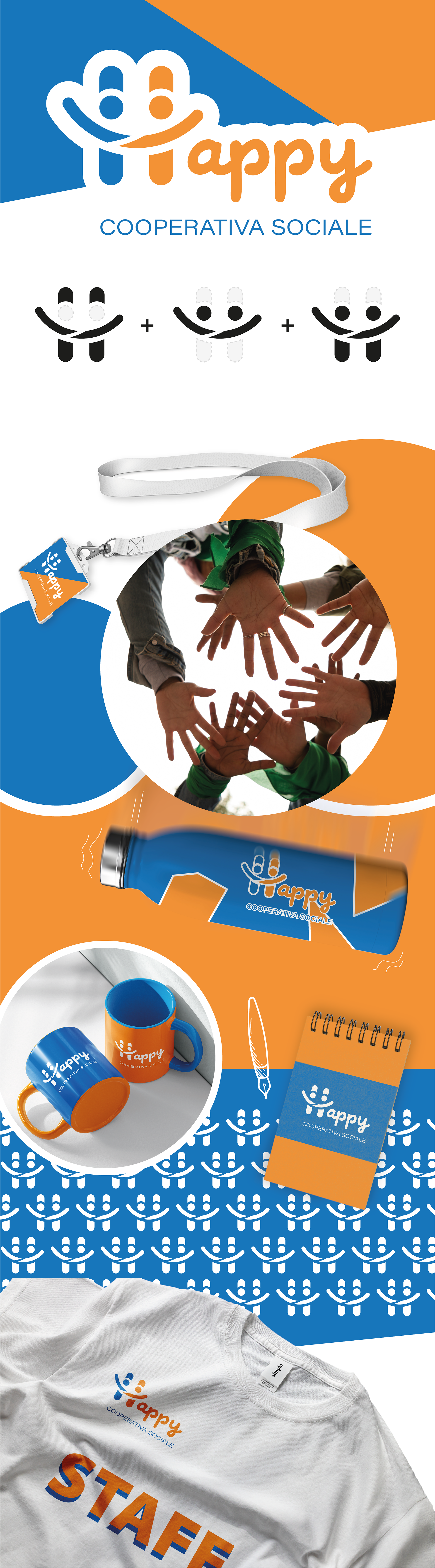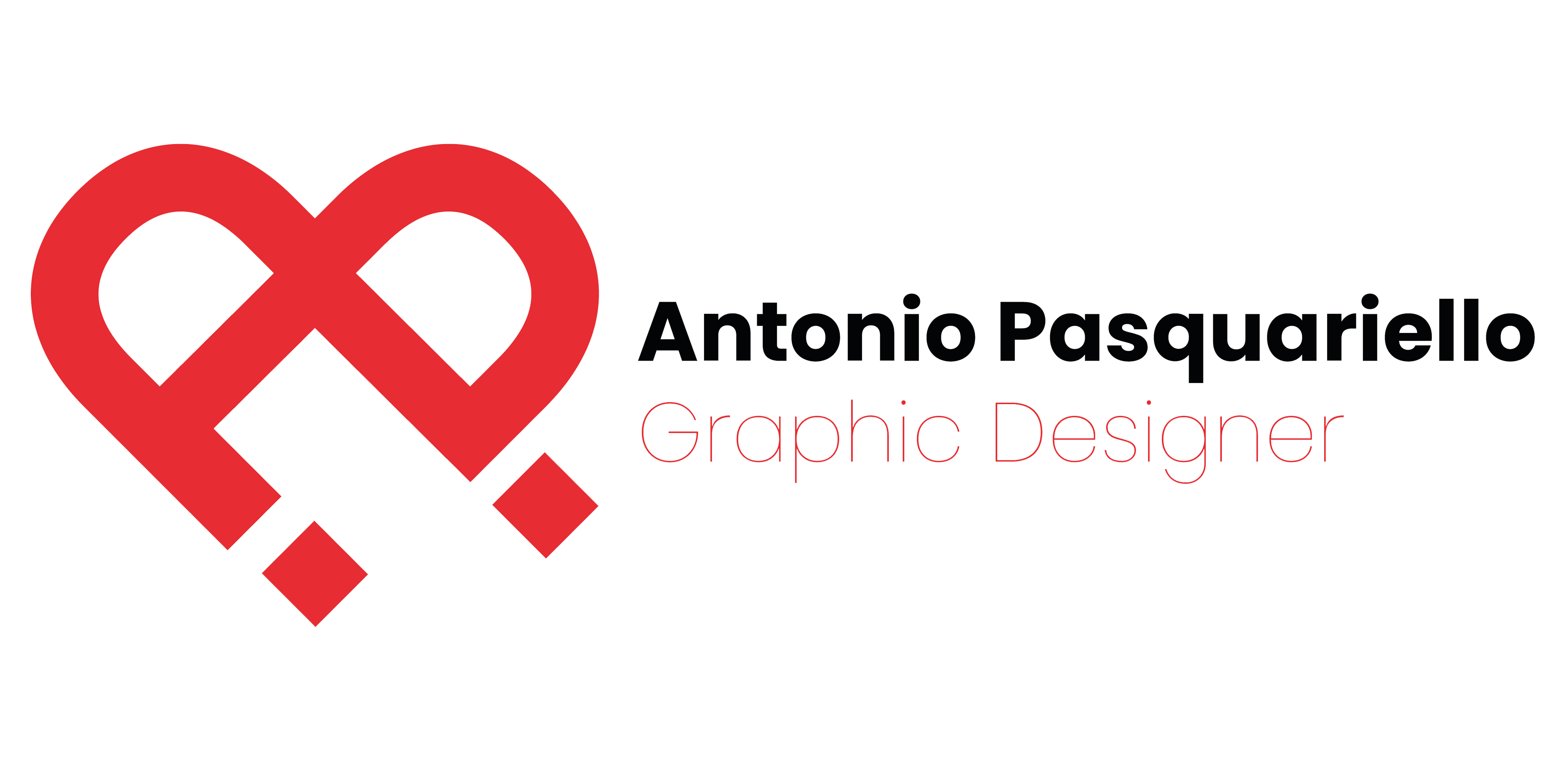
Il logo è stato concepito per includere tre elementi chiave: un sorriso per evocare la parola "happy", la lettera H come iniziale del nome, e due persone che si tendono la mano per simboleggiare l'importanza dell'aiutarsi reciprocamente. I colori sono stati scelti con attenzione: il blu rappresenta fiducia, sicurezza e stabilità, trasmettendo professionalità, affidabilità, calma e serenità. Questo potrebbe instillare un senso di sicurezza sia nei membri della cooperativa sociale sia in coloro che interagiscono con essa. D'altro canto, l'arancione comunica entusiasmo, creatività e calore, riflettendo la dinamicità e l'entusiasmo della cooperativa nel servire la comunità e nell'innovare per il bene comune.
The idea was to encapsulate three key elements within the logo: a smile, to evoke the word "happy"; the letter H, which is the initial of the name; and finally, two people reaching out to each other, to underline the importance of helping one another. The choice of colors was not random: blue represents trust, security, and stability. It's a color that communicates professionalism and reliability, often associated with calmness and serenity. It could convey a sense of security for the members of the social cooperative and those who interact with it, while orange is a color that communicates enthusiasm, creativity, and warmth. It can be used to represent the dynamism and enthusiasm of the social cooperative in serving the community and innovating for the common good.