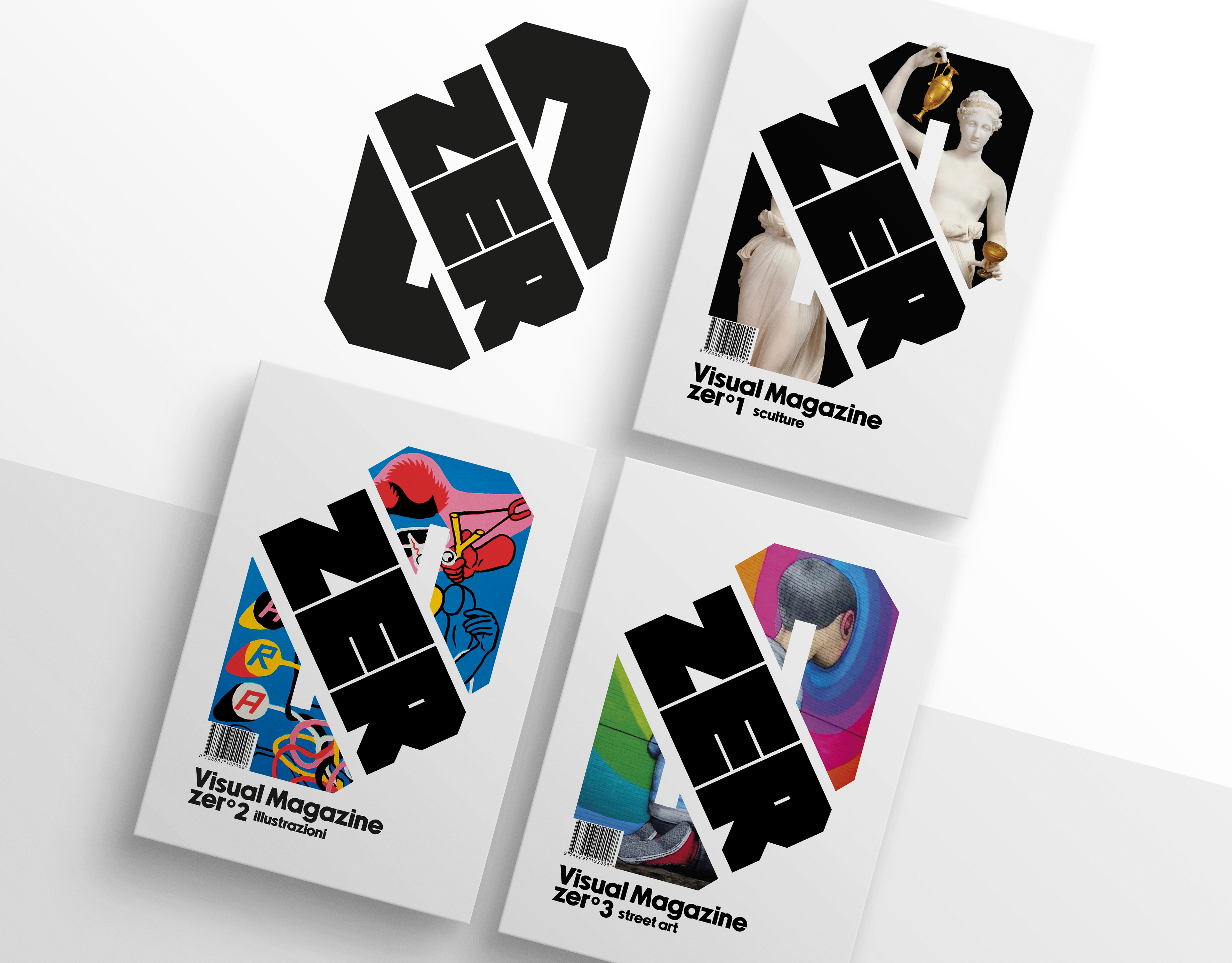
Una brand identity fresca, dinamica e sorprendentemente fuori dagli schemi per un professionista della vista. L’obiettivo era distinguersi nettamente dalla comunicazione tradizionale, spesso fredda e impersonale del settore ottico, puntando su uno stile immediatamente riconoscibile e memorabile.
Il concept ruota attorno a un gesto semplice ma potente: la mano che forma un "OK", reinterpretata in chiave visiva con l’aggiunta di un occhio centrale. Il risultato è un logo dal forte impatto visivo e simbolico, capace di trasmettere fiducia, empatia e allegria.
La palette cromatica si basa su un contrasto fortissimo tra giallo acceso e blu profondo, due colori che evocano rispettivamente energia e affidabilità. Una scelta audace, volutamente pop, che rompe la monotonia del settore e attira lo sguardo. Questo contrasto cromatico non è solo estetico, ma strategico: permette al brand di essere immediatamente identificabile, anche da lontano o in contesti molto affollati visivamente.
La brand identity è pensata per un pubblico giovane e dinamico, ma non esclusivamente: il tono empatico e l’estetica accessibile abbracciano target anche più ampi, rendendo il brand vicino e riconoscibile per tutti.
A fresh, dynamic, and boldly unconventional brand identity for a vision care professional. The goal was to stand out from the traditionally cold and impersonal communication style of the optical industry, opting instead for a look and feel that’s instantly recognizable and memorable.
The concept centers around a simple yet powerful gesture: the hand forming an "OK" sign, reimagined with a central eye to give it a visual twist. The result is a logo with strong symbolic and visual impact — conveying trust, empathy, and a sense of playfulness.
The tone of voice used in the copywriting is direct and ironic, yet always reassuring. “Not in good hands, but in the best” is a tagline that perfectly sums up the brand’s promise, playing with language in a way that sticks in your mind.
The brand identity is designed primarily for a young and dynamic audience, but it’s not limited to that. Thanks to its empathetic tone and accessible aesthetics, it resonates with a broader target — making the brand feel friendly and instantly recognizable to all.