COMICON mi ha messo alla prova con una serie di esercitazioni grafiche per testare la mia creatività, adattabilità e attenzione al brand. Ecco cosa ho realizzato:
1. Format social:
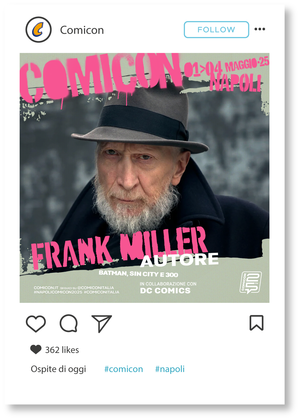
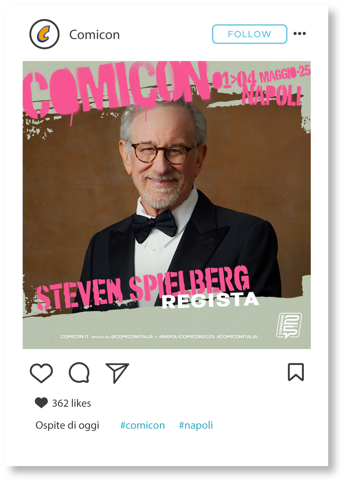
Ho aggiornato i visual ufficiali del festival per due ospiti fittizi (Frank Miller e Steven Spielberg), curando immagini, testi e formati per feed e stories. Obiettivo: restare fedeli allo stile COMICON, rispettando tutte le regole grafiche.
Ho aggiornato i visual ufficiali del festival per due ospiti fittizi (Frank Miller e Steven Spielberg), curando immagini, testi e formati per feed e stories. Obiettivo: restare fedeli allo stile COMICON, rispettando tutte le regole grafiche.
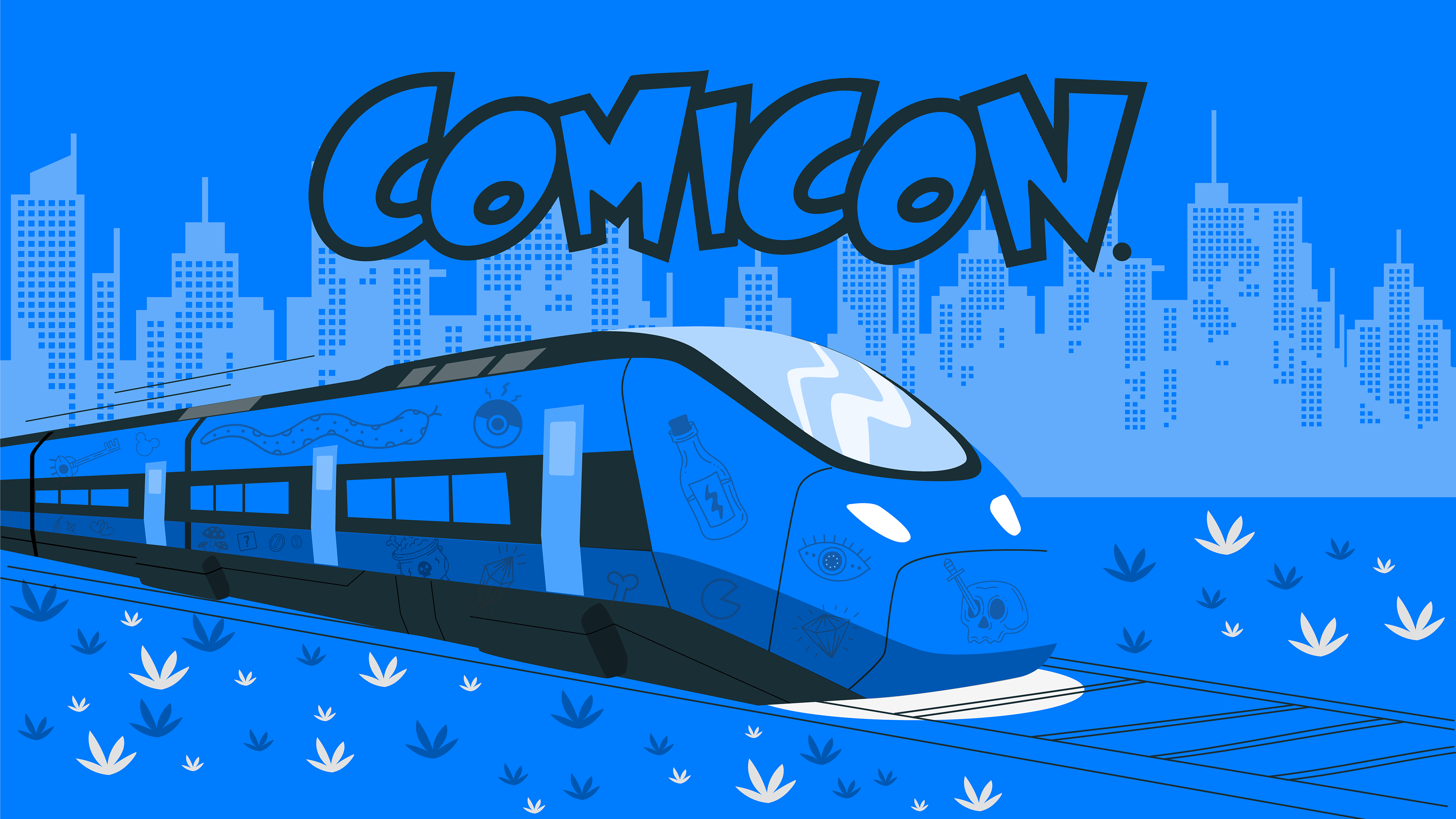
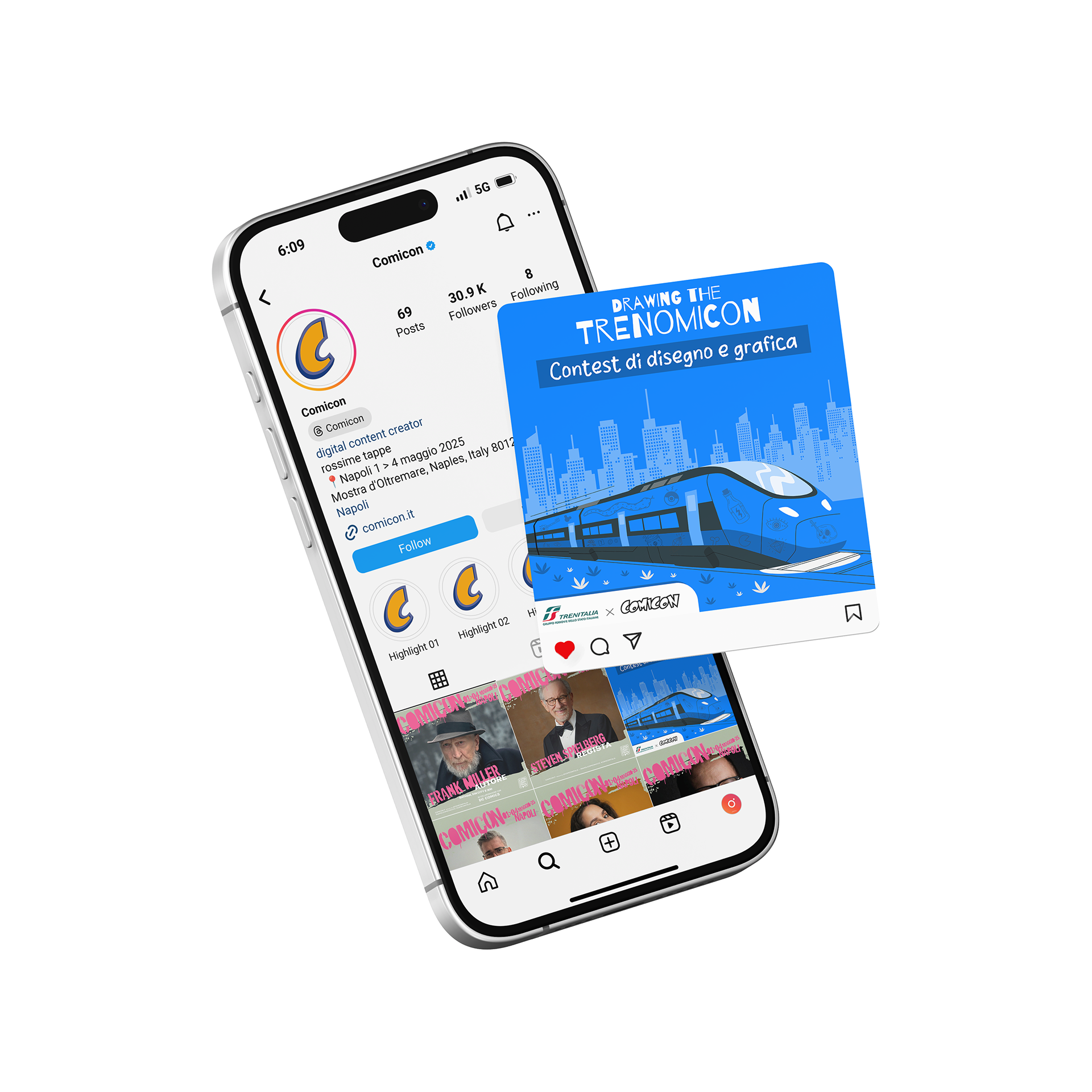
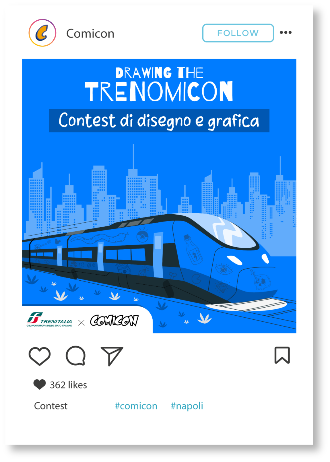
2. Visual Drawing the TRENOMICON:
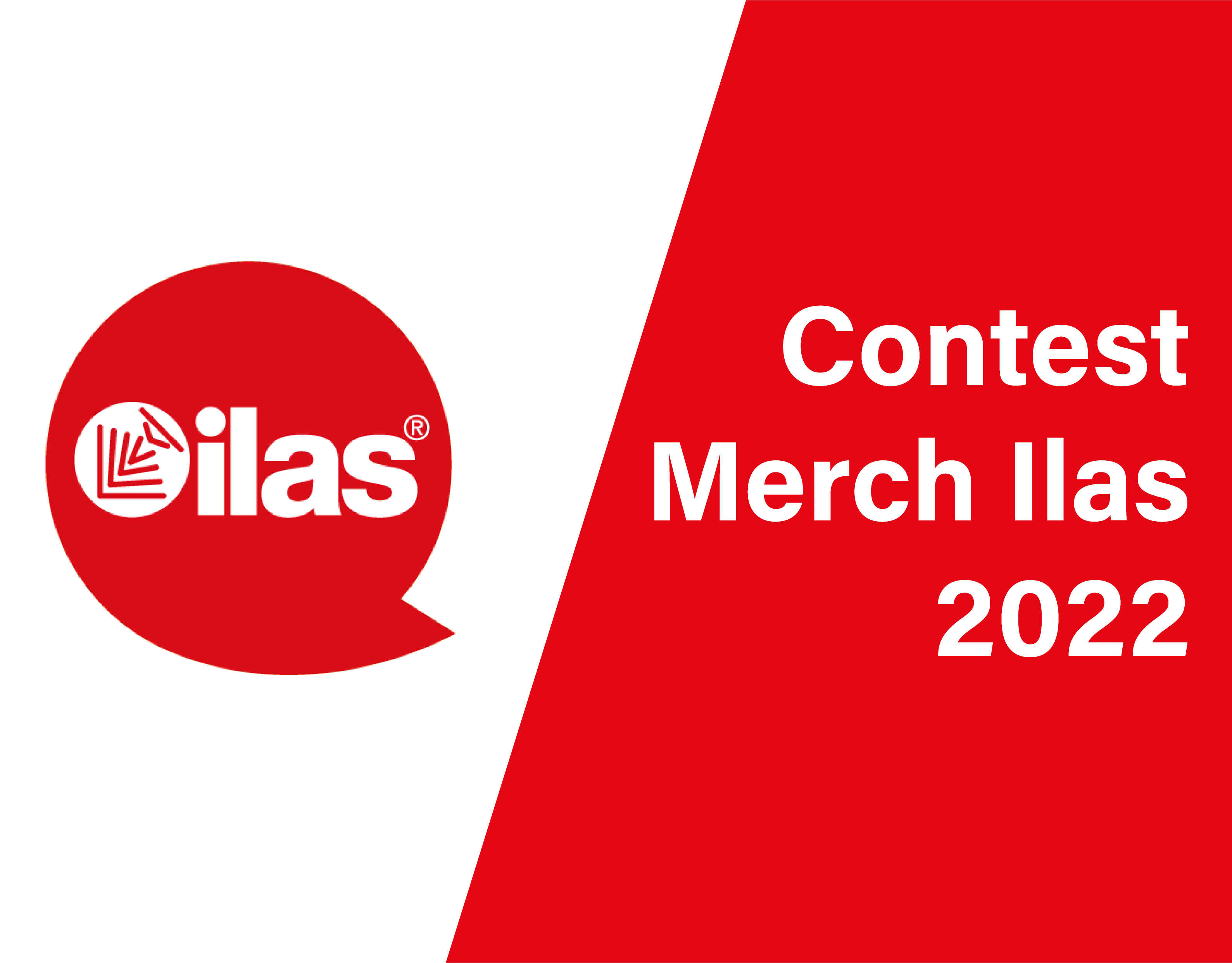
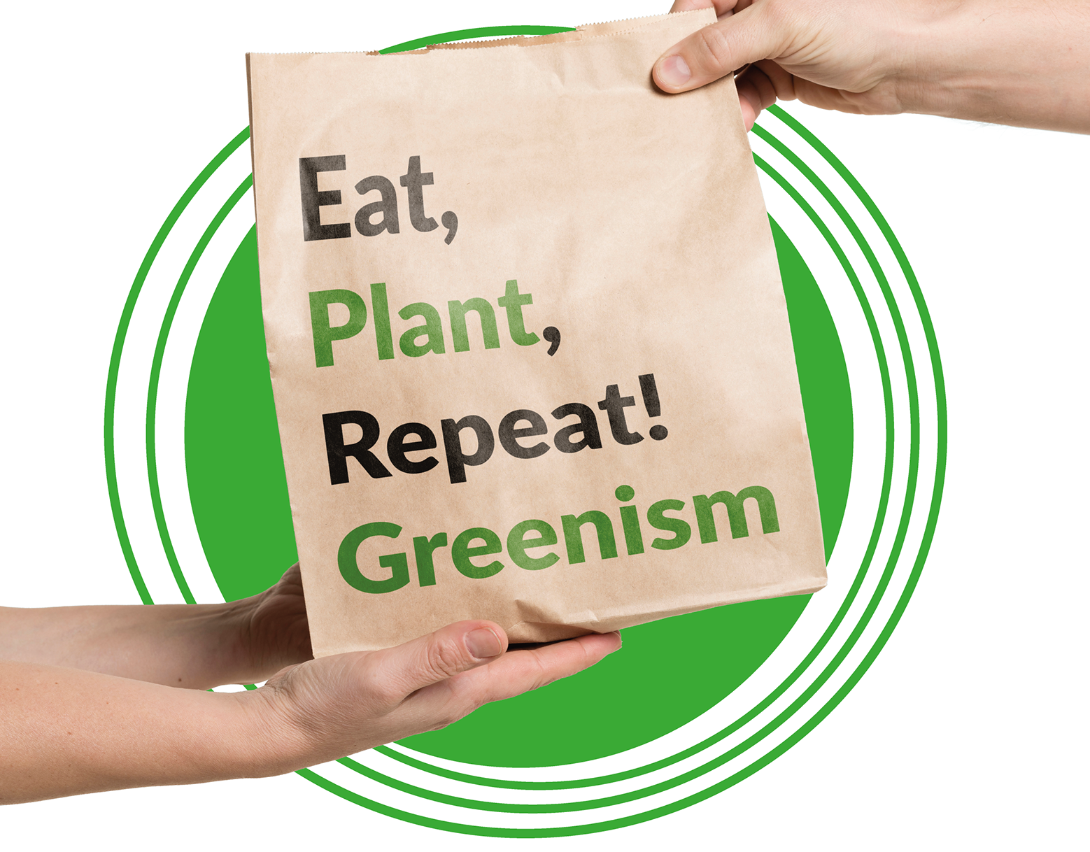
Per il contest in collaborazione con Trenitalia ho ideato un visual originale partendo da zero: logo, palette e stile social, tutto pensato per attirare creativi e illustratori, strizzando l’occhio alla cultura pop.
Per il contest in collaborazione con Trenitalia ho ideato un visual originale partendo da zero: logo, palette e stile social, tutto pensato per attirare creativi e illustratori, strizzando l’occhio alla cultura pop.
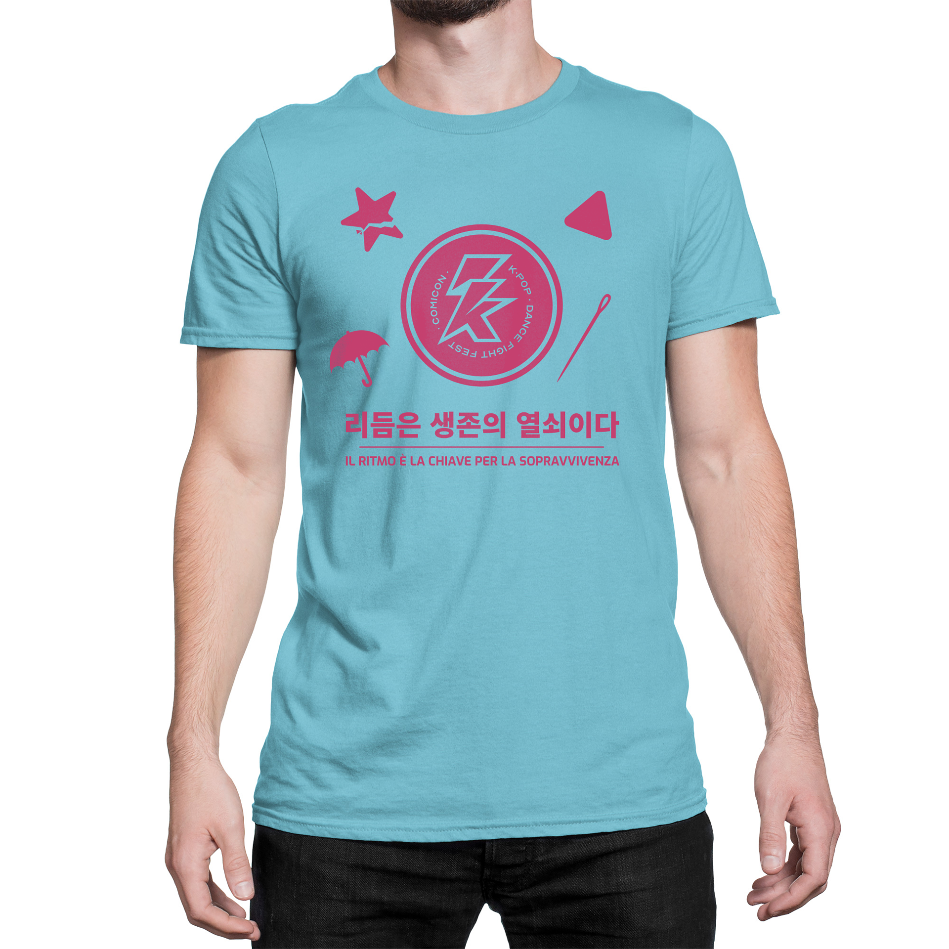
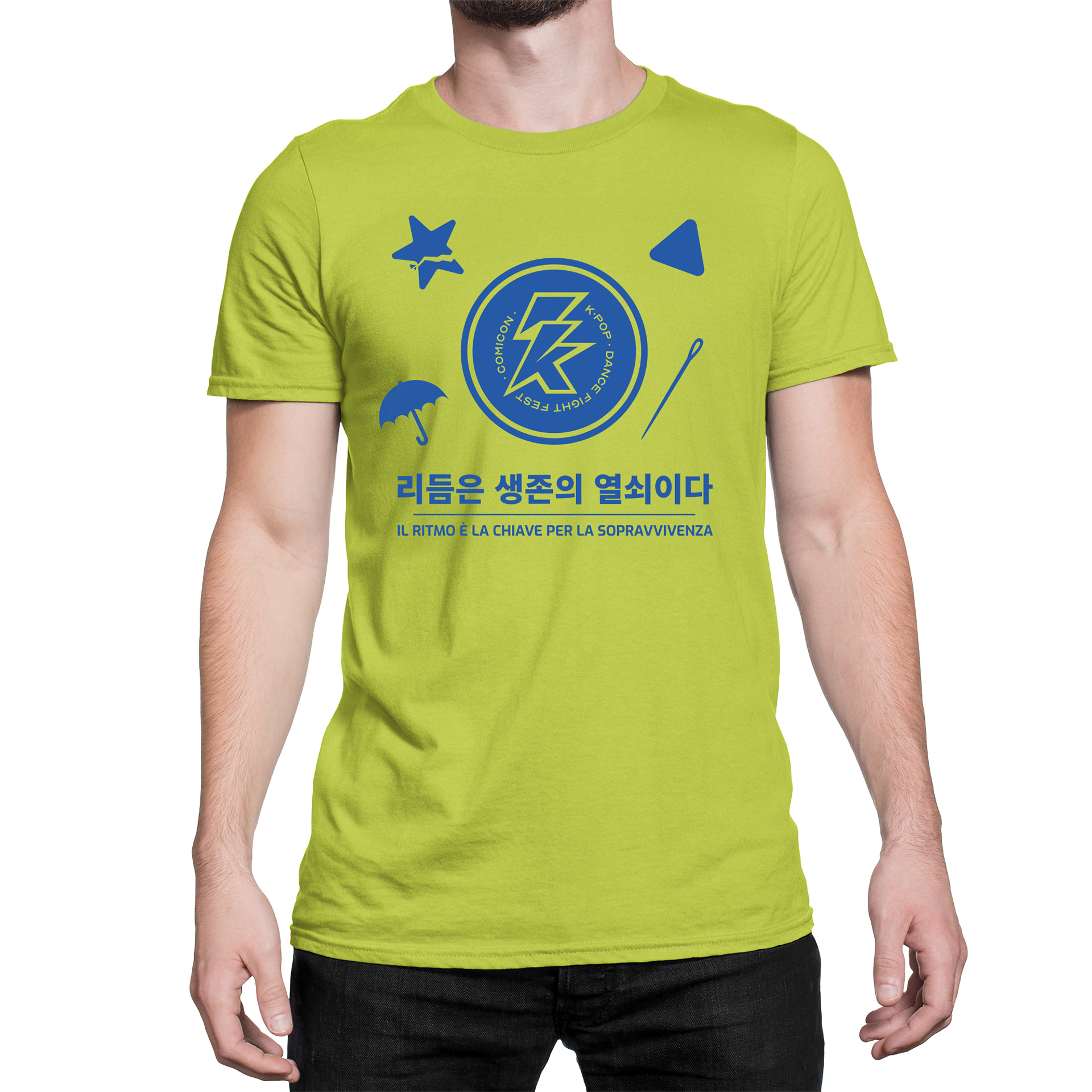
3. Per la T-shirt ho seguito un’intuizione semplice ma d’impatto: il logo, già tondo, si prestava perfettamente a diventare un biscotto ispirato a Squid Game. Un’idea che strizza l’occhio al trend del momento ma anche al tema della gara di danza coreana. Il risultato? Una maglietta pensata non come un semplice gadget, ma come qualcosa che la gente avrebbe davvero avuto voglia di indossare.
COMICON challenged me with a series of graphic exercises to test my creativity, adaptability, and attention to brand identity. Here's what I worked on:
1. Social Media Format:
I updated the official festival visuals for two fictional guests (Frank Miller and Steven Spielberg), taking care of images, copy, and formats for both feed and stories. The goal: stay true to COMICON’s style while respecting all visual guidelines.
I updated the official festival visuals for two fictional guests (Frank Miller and Steven Spielberg), taking care of images, copy, and formats for both feed and stories. The goal: stay true to COMICON’s style while respecting all visual guidelines.
2. Visual – Drawing the TRENOMICON:
For the contest in collaboration with Trenitalia, I created an original visual from scratch: logo, color palette, and social look & feel – all designed to engage creatives and illustrators, with a clear pop culture vibe.
For the contest in collaboration with Trenitalia, I created an original visual from scratch: logo, color palette, and social look & feel – all designed to engage creatives and illustrators, with a clear pop culture vibe.
3. For the T-shirt, I followed a simple yet impactful idea: the logo, already circular, was a perfect fit to become a Squid Game-inspired cookie. A concept that taps into the current trend while also connecting to the theme of the Korean dance competition. The result? A T-shirt designed not as just a basic piece of merch, but as something people would actually want to wear.